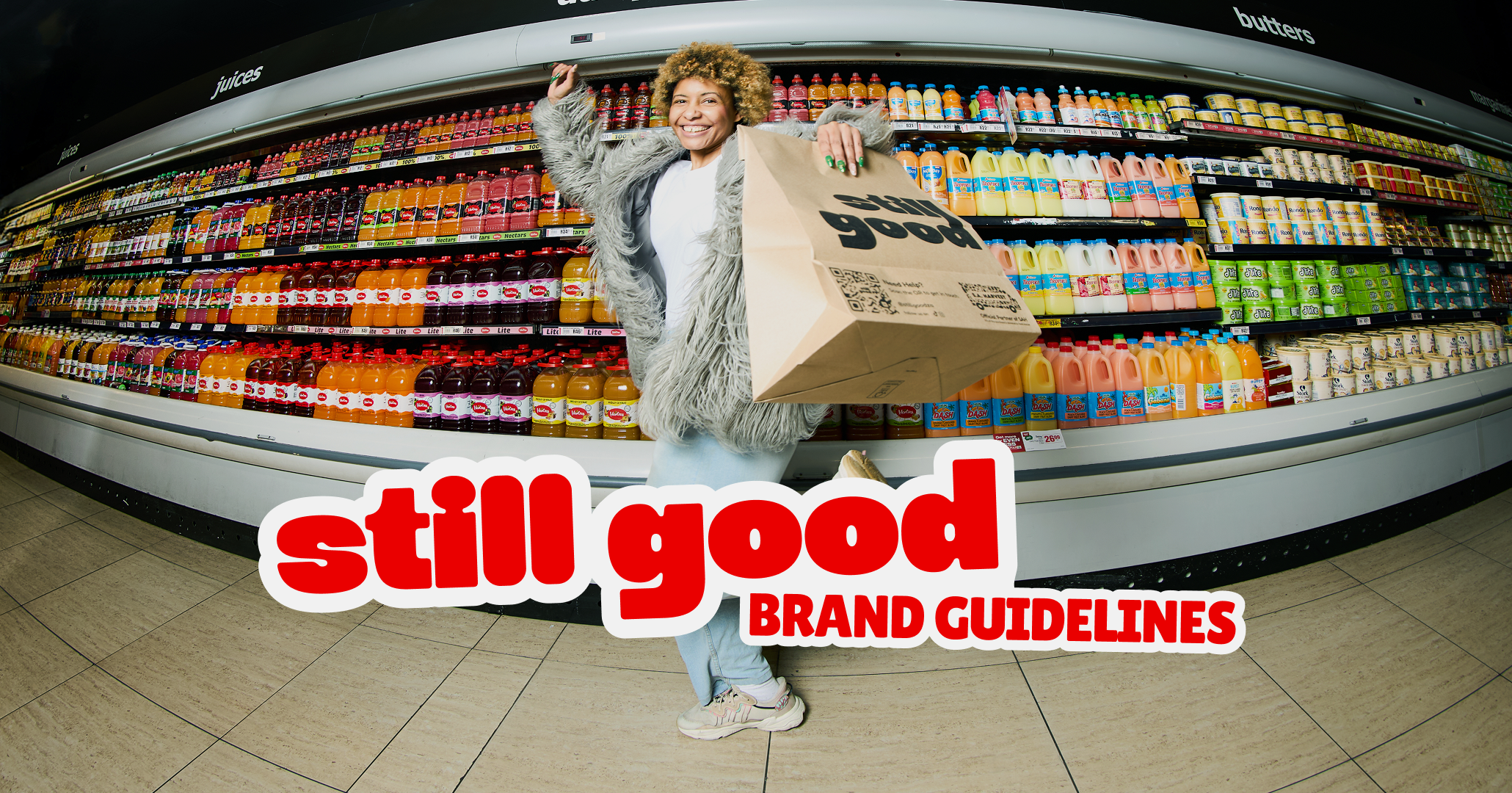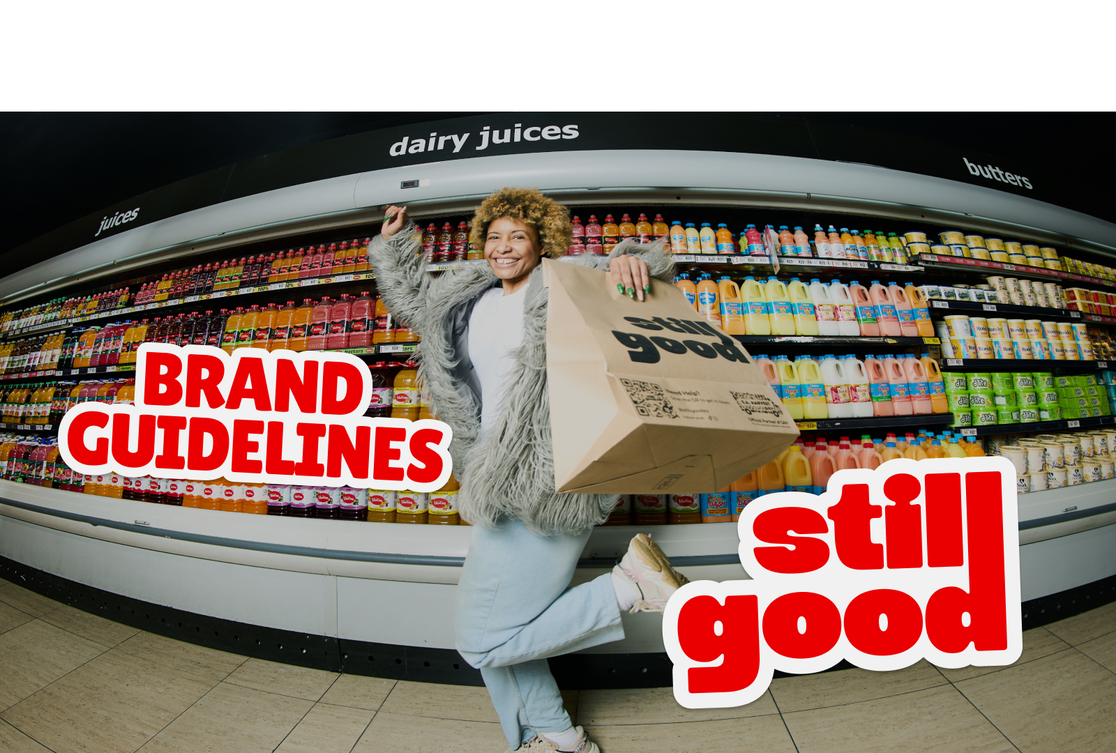
Brand Guidelines
This guide defines the visual language, design style, and principles that shape a clear and consistent brand experience, no matter the team or area of expertise.
At its core, still good is about reducing waste in retail while increasing profits for our partners. This guide lays out the essential design standards that bring our brand to life, from our color system and typography to accessibility benchmarks and documentation.
Whether you're designing for digital platforms or printed materials, these guidelines ensure every touchpoint reflects the trust and efficiency at the heart of still good.
Contents
01 Brand Strategy
02 Personality
05 Typography
06 Art Direction
01 Brand Strategy
At still good, a purpose-driven social enterprise, we’re dedicated to tackling food waste while improving profitability for our retail partners. We bridge the gap between retailers with surplus or short-dated stock and a growing community of value-conscious consumers eager to access affordable, quality food.
Every year, tonnes of edible food are discarded due to approaching sell-by dates, labeling changes, or minor imperfections, even though it’s perfectly good to eat. Our platform gives retailers a simple and efficient way to turn this challenge into an opportunity. By redistributing surplus and close-to-sell-by products, we help partners recover lost revenue, attract new customers, and strengthen their sustainability credentials. All without adding operational complexity.
Our core focus is to make it easy for retailers to:
- Reduce food waste through responsible redistribution,
- Recover costs by converting potential losses into measurable revenue, and
- Drive foot traffic by offering consumers real value and savings.
Beyond the business impact still good offers, our work directly supports a broader social mission: improving food security and ensuring that nutritious, affordable food reaches South Africans who need it. By connecting retailers, communities, and conscious consumers, we’re helping to build a more sustainable and equitable food system.
02 Personality
We bring our brand to life through great deals for both customer and partner, colorful visuals and the words we write and speak. The way we communicate is through clear and intentional design language. Our direct, approachable, and transparent voice ensures that joining us feels like a no-brainer. We ensure our partners can move forward with confidence.
Tone & Voice
Our Vision: why we exist
To create a future where every retailer maximizes their potential and every consumer benefits from great deals
Our Mission: what we do
Bring bold new ideas to the retail space and make irresistable offers to customers
Our Promise: how we help
Empower retailers to move forward with accuracy and efficiency
Sample Copy
Making Groceries Affordable, Without Compromise
At still good, we believe everyone deserves access to quality food at prices that make sense. By rescuing surplus and near-expiry stock, we turn what would go to waste into incredible savings for you.
We Handle the Waste, You Enjoy the Savings
Food waste is a massive problem, but it doesn't have to be yours. We take care of sourcing, sorting, and repurposing surplus groceries so you can shop smarter, save more, and feel good about every bag you buy.
Good for Your Wallet. Great for the World.
Every still good bag helps fight hunger, reduce waste, and support local communities. Together, small choices make a big difference - for your budget, and for the planet we all share.
See Value Differently - It's still good
We're redefining what "good" means in groceries. Perfectly edible, top-quality products that might have gone to waste now find a second chance on your table - because value isn't just about price, it's about purpose too.
03 Logo
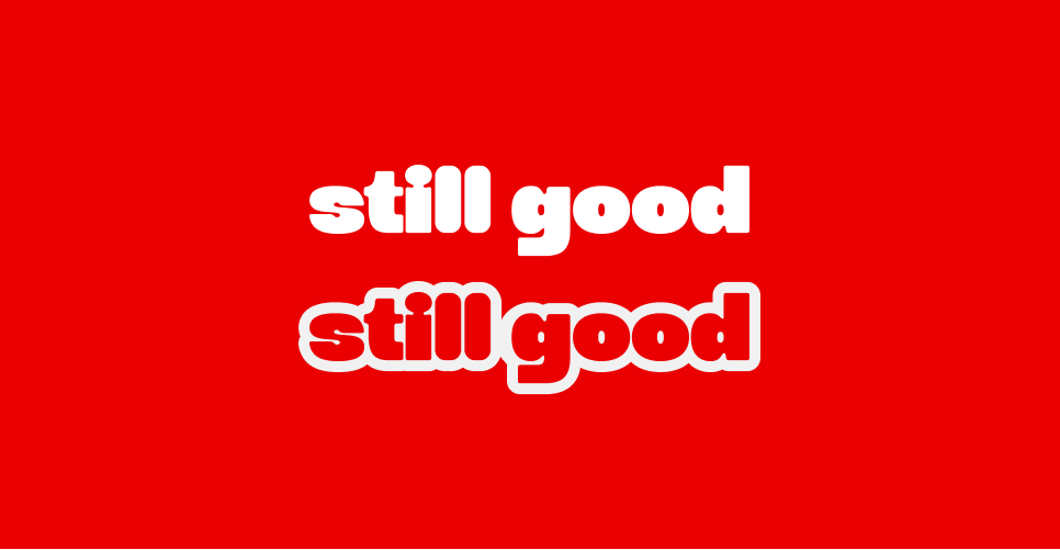
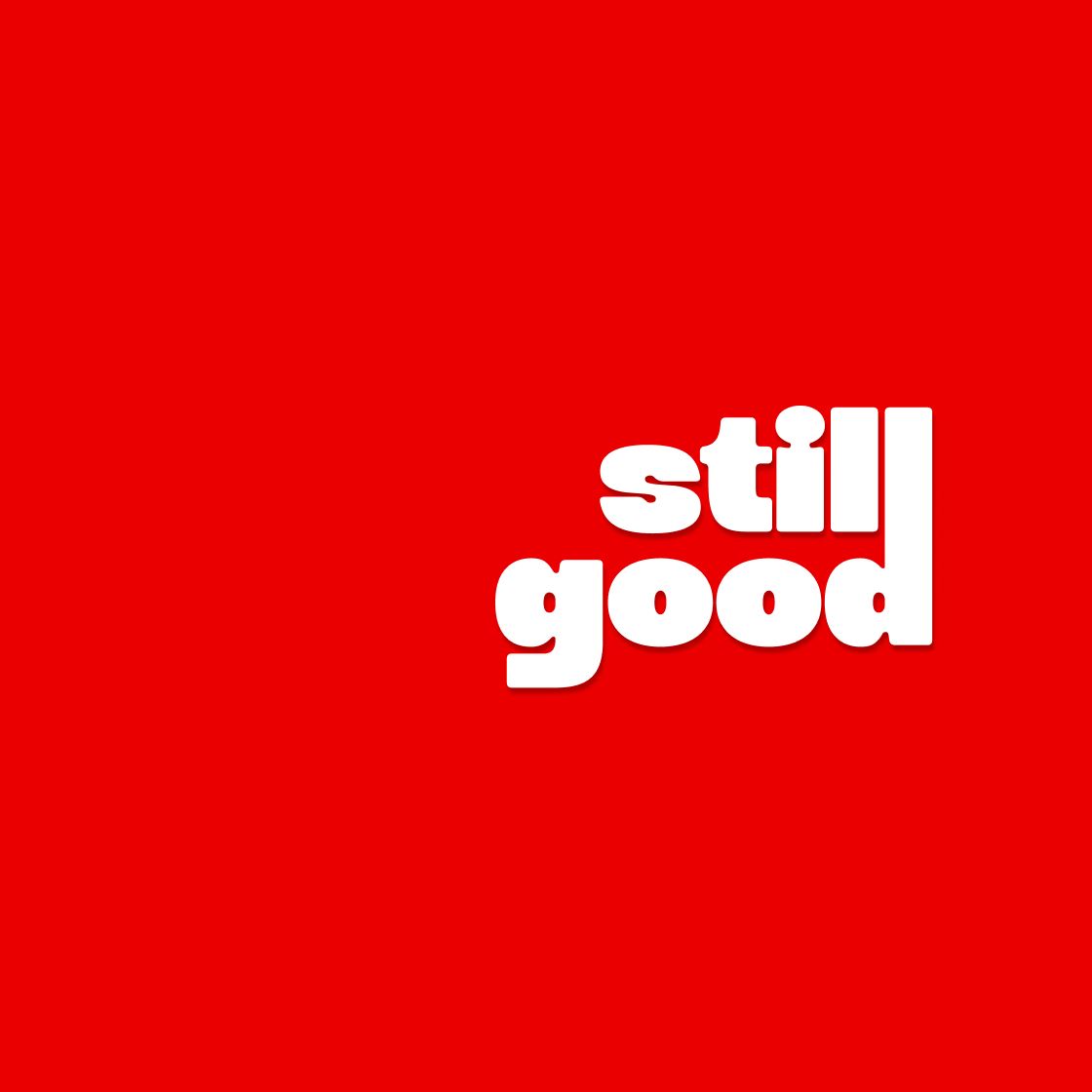
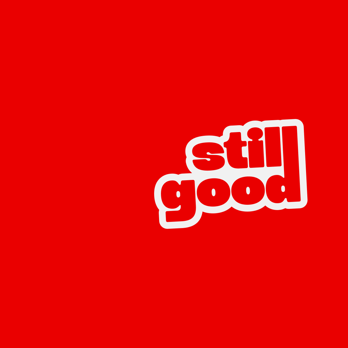
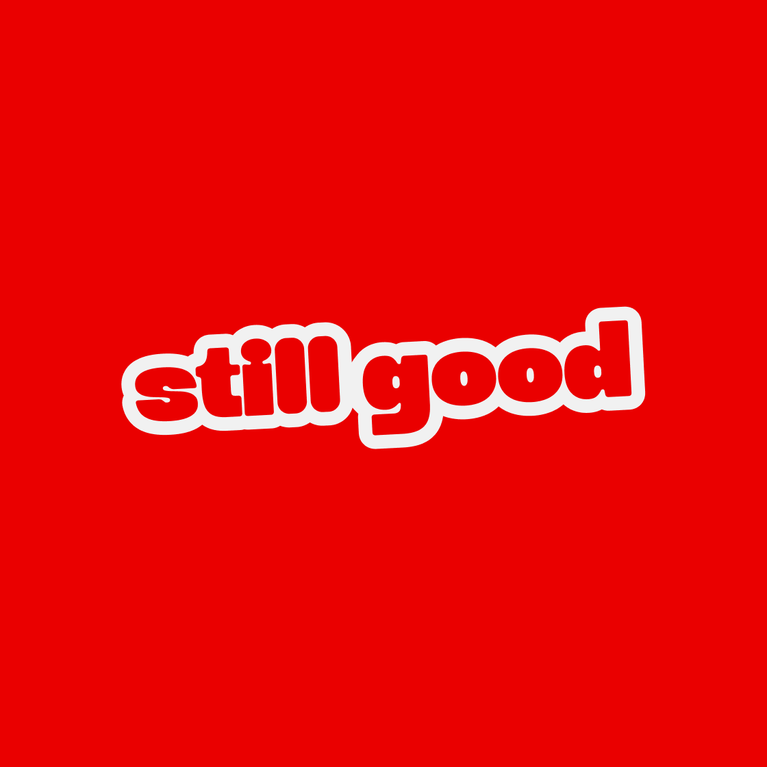
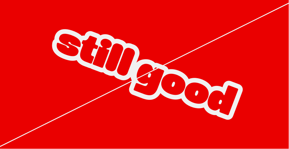
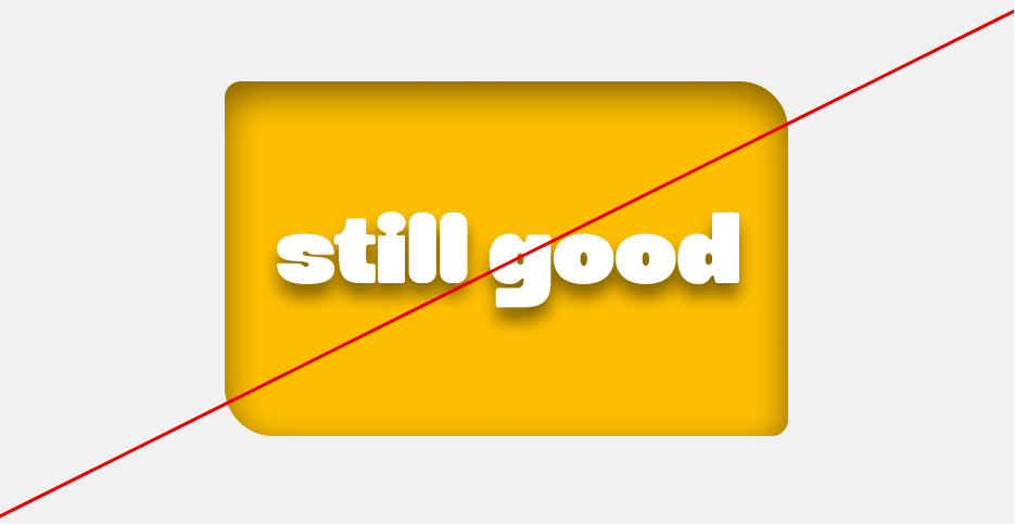
The still good logo is clean, bold and modern, with slightly rounded edges to communicate playfulness in our visual style, symbolizing our ability to be fun yet focused, bringing big, bold ideas forward in every space we’re in.
With our colour palette reinforcing bold levels of trust and clarity, strong reds reflecting excitement, urgency and energy, while our yellow brings forward our creativity and fun side.
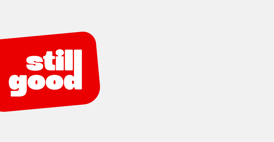
More than just words, the Still Good logo embodies our promise that produce handled by our partners is exactly that - still good. The sticker version adds a playful nod to how the quality and state of produce are often communicated through stickers.
Core Lockups

Print marketing and packaging
Primary choice for business cards, letterheads, product packaging, and any materials where premium brand presentation is critical
Corporate comms and partnerships
Essential for official documents, email signatures, partnership announcements with Pick n Pay and Spar, and business development materials
Digital storefronts and E-commerce
The clean white-on-red and red-on-white versions provide maximum brand recognition for our main website, store headers, and checkout processes.
Secondary Lockups
Social media content creation
The yellow variant provides better contrast against busy food and bag photography and lifestyle images common on Instagram and TikTok. This is also the core colour for captioning.
Influencer collaboration materials
Offers visual variety for brand awareness campaigns while maintaining recognizability when red clashes with content themes.
Seasonal and promotional campaigns
Perfect for highlighting special offers, seasonal promotions, or when you need to differentiate from competitors and corporate partners using red.
Video content
The gold/yellow and off-white works exceptionally well over food imagery where red might compete with natural food colours.
Themed Lockups

Educational and storytelling content
The sticker aesthetic immediately communicates our surplus and short dated food mission and creates instant recognition of your value proposition.
Behind-the-scenes marketing
Perfect for warehouse content, supplier relationship stories, and "rescue food" narratives that highlight our sustainability mission.
Point-of-sale and retail integration
These versions bridge the gap between traditional food labelling and modern branding, making still good feel familiar in grocery contexts.
Community engagement initiatives
The approachable, utilitarian aesthetic works well for food education content, sustainability messaging, and community partnerships.
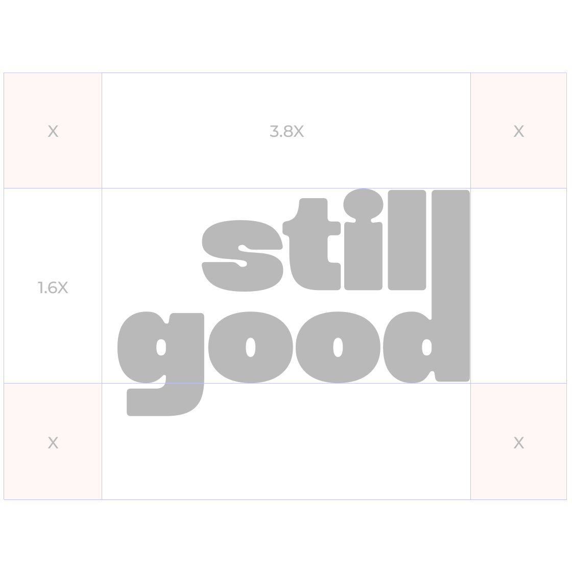
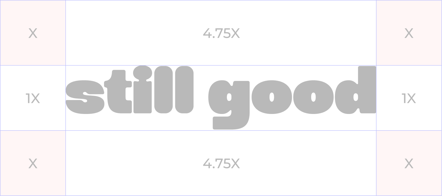
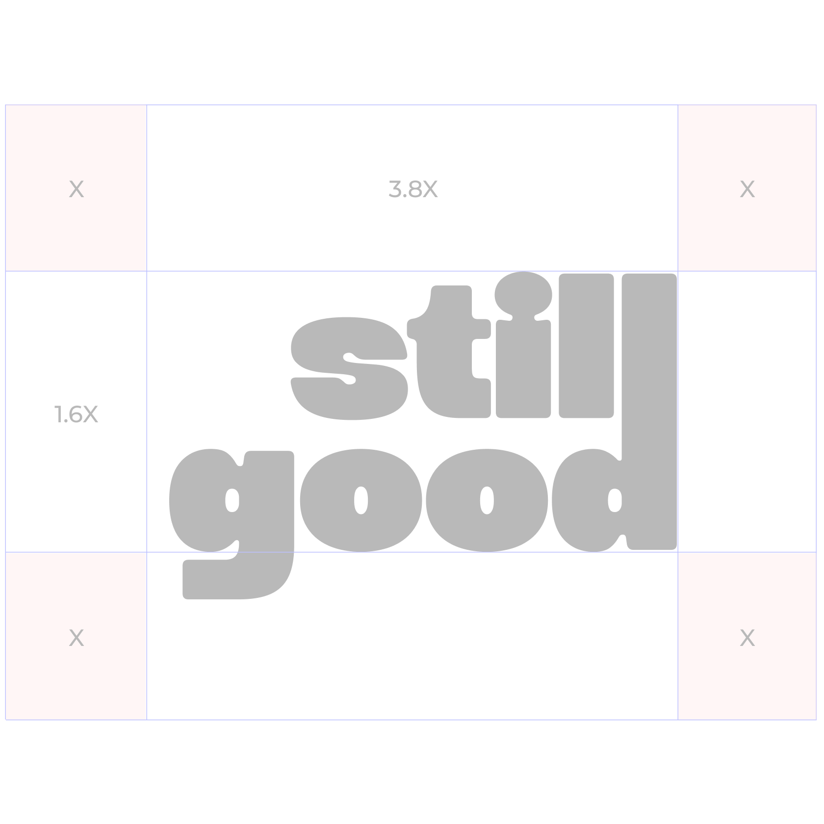
Clearspace
Usage
Do not align vertical logo to the left (Incorrect config)
Unless within a shape (Correct config)
Do not use inner line stroke on the logo
Do not use gradients on the logo
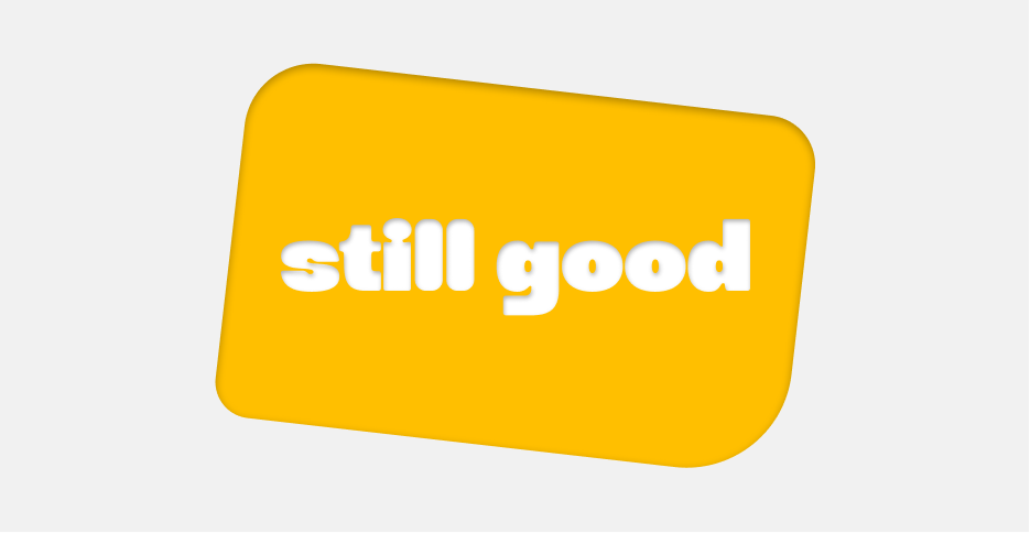
No more than 3° rotation in either direction
Only rotate themed logo
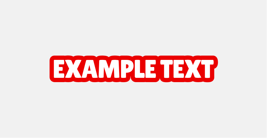
Incorrect Drop/Inner shadow usage on red
Correct Drop/Inner shadow usage on red
Incorrect Drop/Inner shadow usage on yellow
Incorrect Drop/Inner shadow usage on yellow
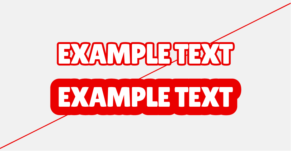
Ensure stroke is large enough - not too large
No white gaps between letters
04 Color
Our colour palette is designed to evoke excitement, urgency, and trust, ensuring that every touchpoint reflects our commitment to accuracy and efficiency.
Together, these colours create a strong, dependable, and versitile brand identity, ensuring that still good is instantly recognized as the go-to solution for financial corrections and optimization.
Primary Palette
Red
Hex: #EA0000
Off White
Hex: #F1F1F1
White
Hex: #FDFDFD
Charcoal Grey
Hex: #3C3C3C
Secondary Palette
Yellow
Hex: #FFBF00
Yellow Variant
Hex: #F1B100
Off-White
Hex: #F1F1F1
White
Hex: #FDFDFD
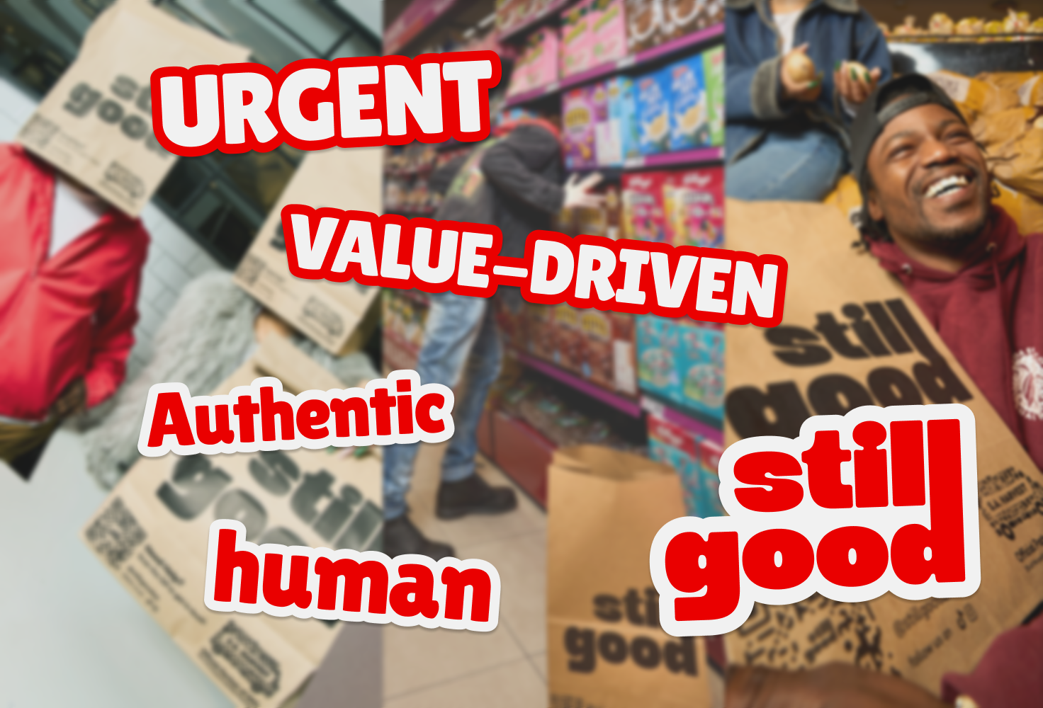
05 Typography
Redo’s typography balances clarity and professionalism with a modern yet timeless type pairing, reinforcing our commitment to accuracy, efficiency, and financial stability.
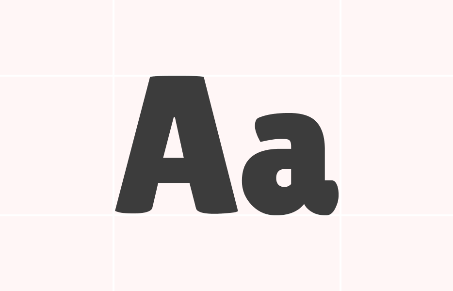
Primary
A distinctive display typeface with rounded edges and condensed structure that commands attention while maintaining warmth. Its bold, friendly appearance makes it ideal for headlines, social media content, and any touchpoint where immediate brand recognition is essential. The font's playful yet authoritative character perfectly embodies our approachable expertise in the surplus grocery space.
Secondary
Provides refined strength for mid-level hierarchy elements. This geometric sans-serif adds professional credibility while maintaining visual harmony with our primary typeface. Used exclusively in its black weight, it ensures consistent impact across H3-H5 headings, subheadings in marketing materials, and emphasis text that requires more gravitas than body copy.
Primary Typeface
Lilita One
Secondary Typeface
Sofia Sans
Sizing
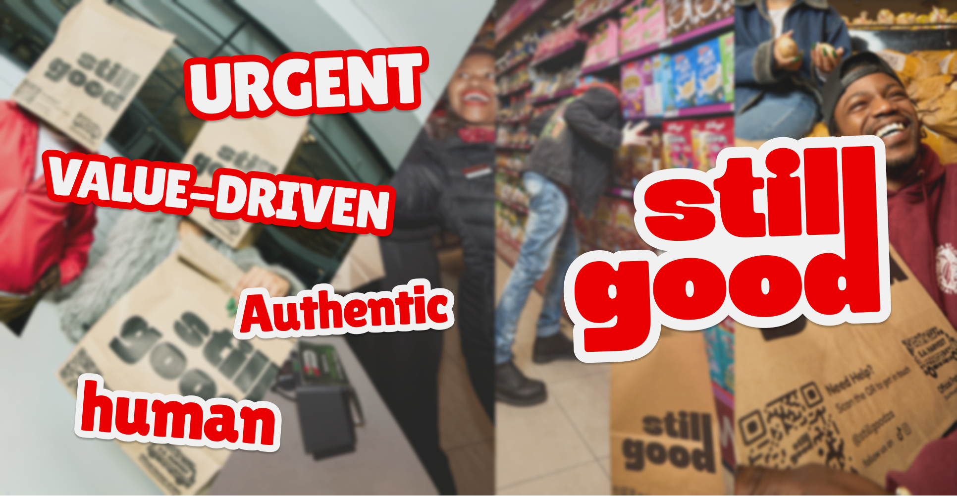
This combination leverages high contrast between a distinctive display font and a neutral workhorse, ensuring clear information hierarchy while maintaining the urgent, value-driven personality essential for Still Good's brand messaging. The pairing works particularly well for action-oriented content where you need to grab attention quickly then guide users through detailed information seamlessly.
MORE CHOW,
LESS CHING!
Type Sizes > 72pt/px
100% Leading
-2% Tracking
Whether it's budget strain, meal planning stress, or food going to landfills, we ensure you fill your table for less with perfectly fresh groceries.
Type Sizes 55–72pt/px
110% Leading
-2% Tracking
Our platform connects you directly with surplus groceries from major retailers, offering 50-70% savings on fresh produce, bakery items, and pantry essentials—so you can stretch your budget without compromising on quality.
Type Sizes 24–55pt/px
120% Leading
-1% Tracking
Rising grocery costs shouldn't force you to choose between quality and affordability. With surprise Value Bags available daily across Gauteng, KZN, and Western Cape, you get the thrill of discovery while saving serious money. Join thousands of families already saving over R40,000 annually with Still Good
Type Sizes 0–24pt/px
130% Leading
0% Tracking
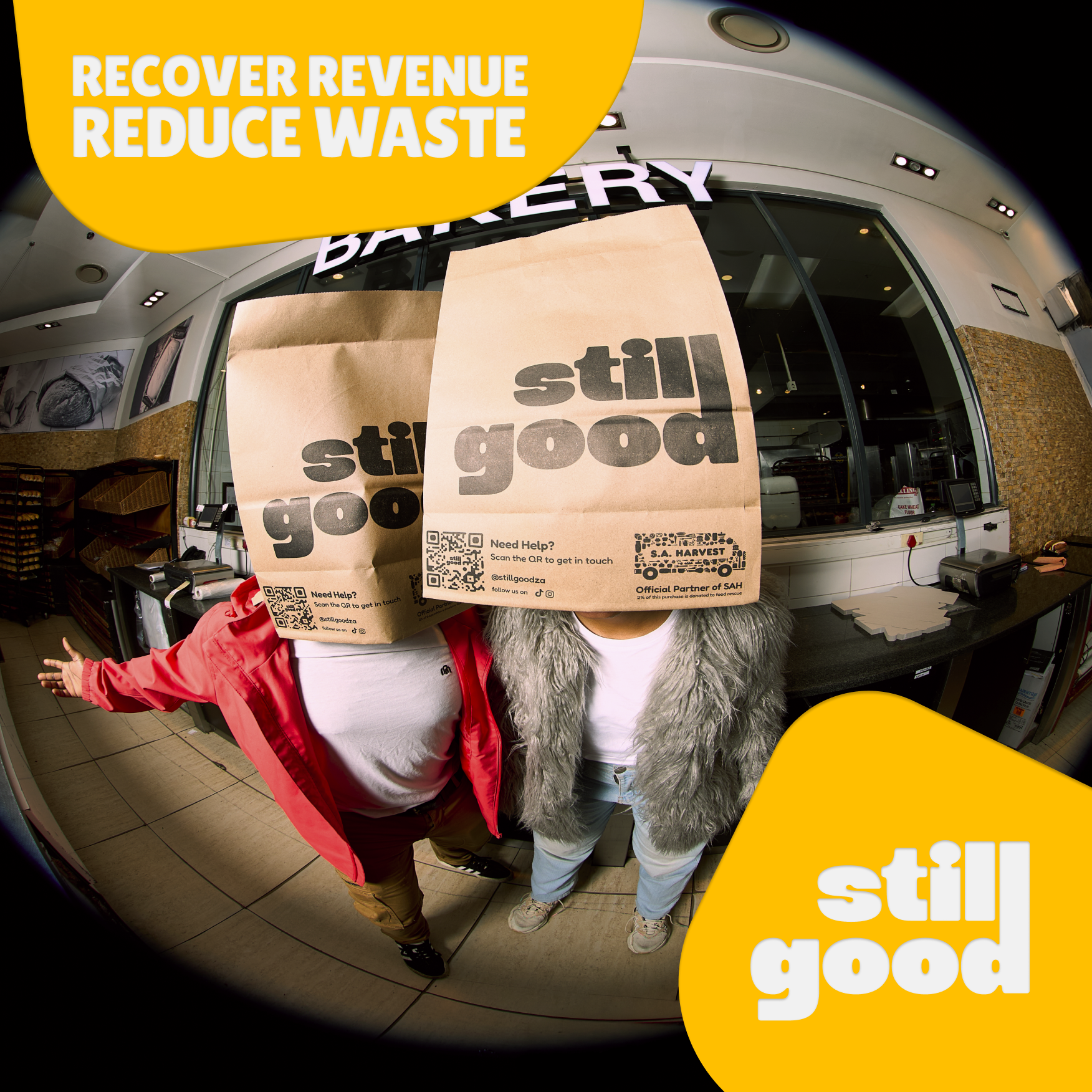
06 Art Direction
still goods photographic style reinforces our brand’s core values—, clarity, and financial empowerment—by showcasing visuals that reflect professionalism, accuracy, and control.
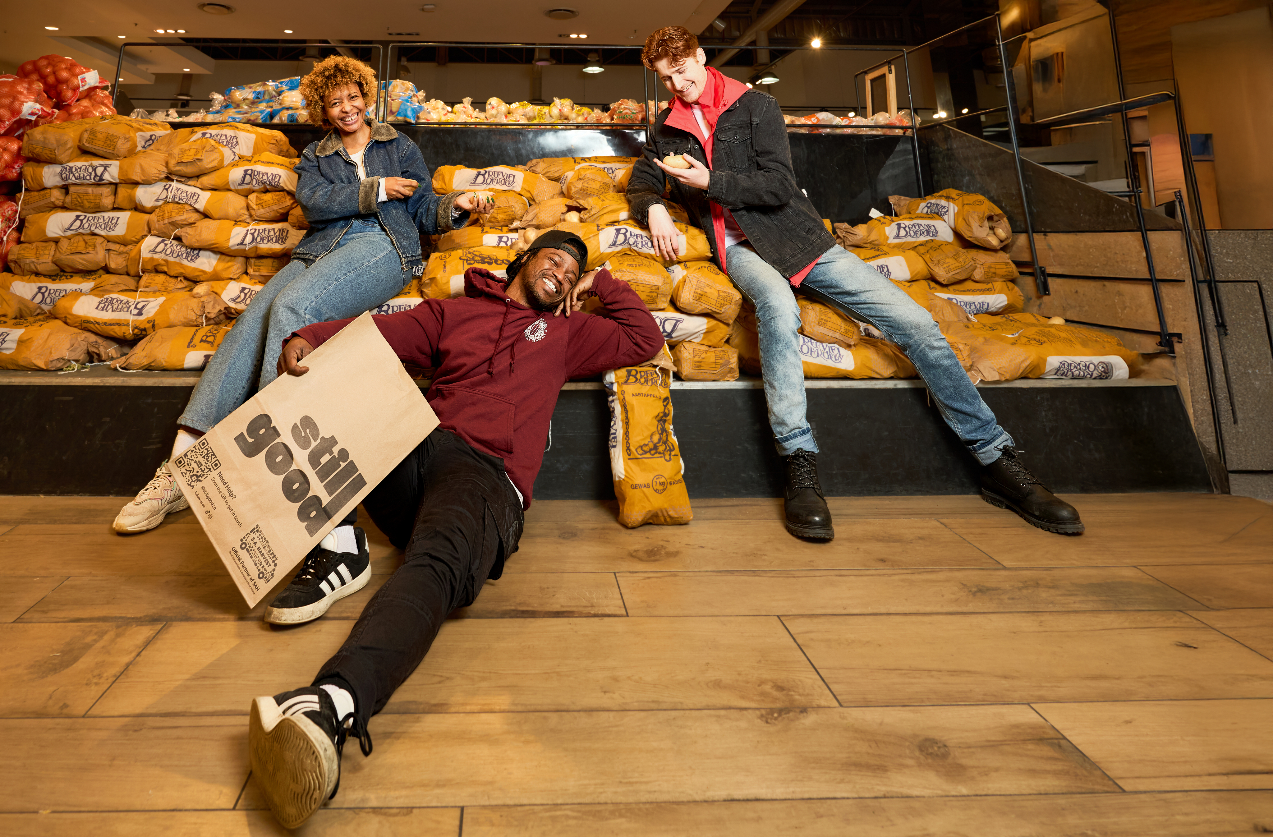
Real Moments, Real Savings
Photography should capture authentic celebrations and unguarded reactions—the genuine surprise of opening a Value Bag, families actually cooking together, people sitting on grocery store floors with their hauls. Avoid overly polished studio shots. Instead, embrace the beautiful imperfection of real life: slightly messy kitchens, natural lighting, candid expressions that show the pure joy of scoring a great deal.

Value Made Visible
Show the tangible proof of savings - overflowing bags next to price tags, before/after grocery receipts, families eating restaurant-quality meals at home. Create visual comparisons that make the value proposition immediately clear.
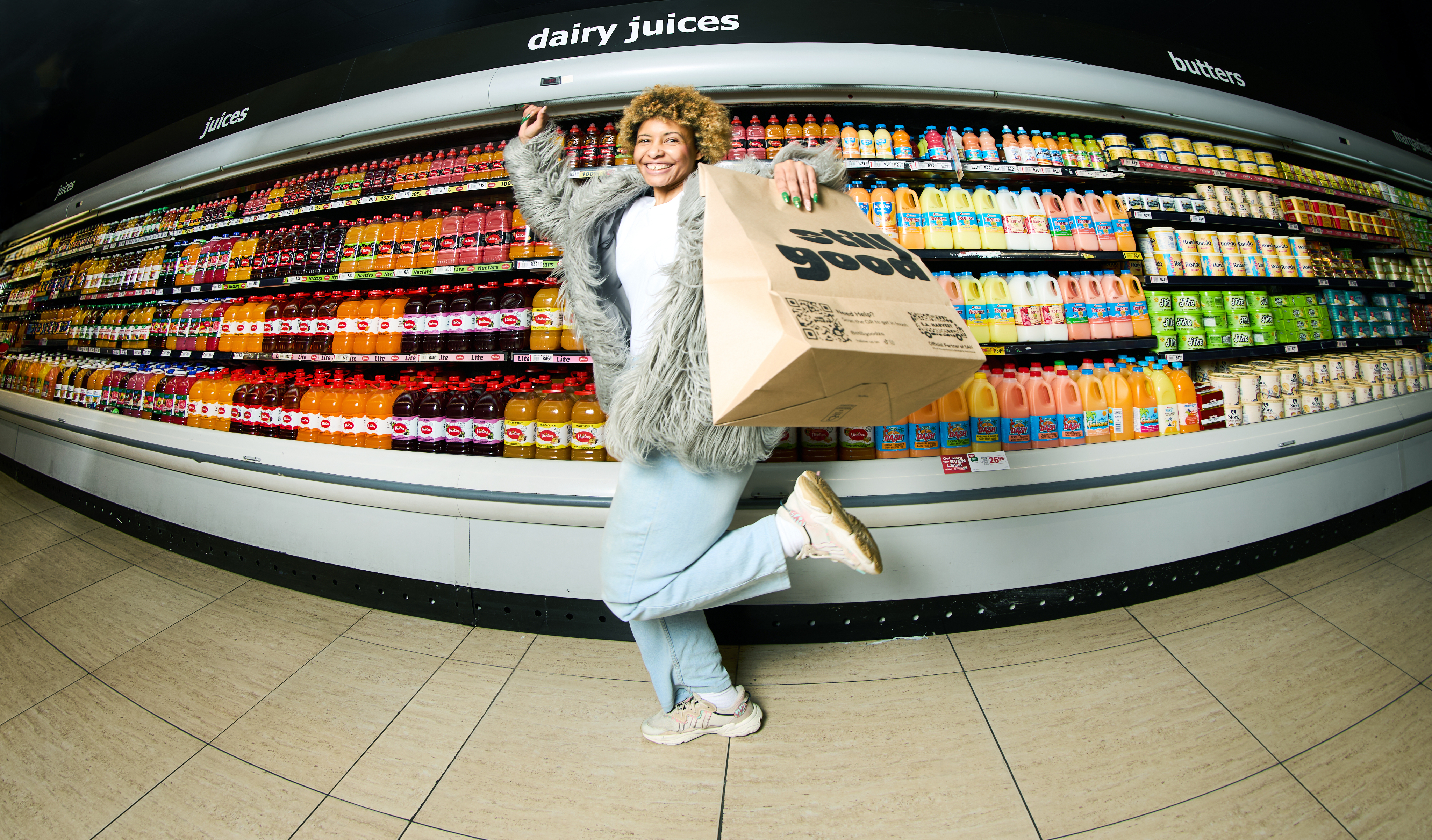
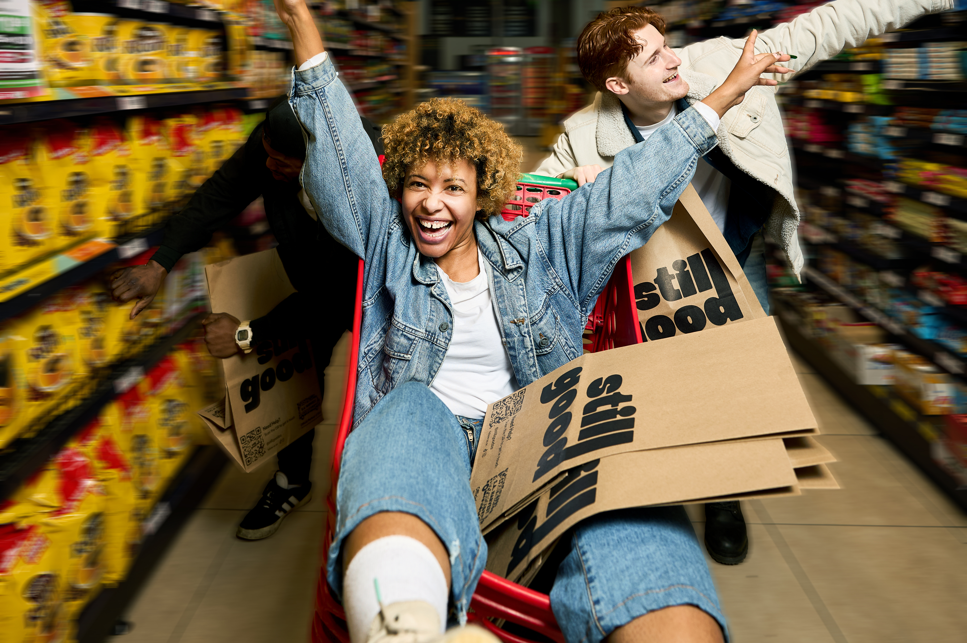
Urgency Through Movement and Energy
Visuals should feel dynamic and time-sensitive - hands reaching for products, people running to catch limited offers, quick bag reveals that create FOMO. Use motion blur, tilted angles, and sequential storytelling to convey that still good operates on "fastest fingers win" energy. Every image should make viewers feel like they're missing out if they don't act now.
Beautifully Imperfect Humanity
Celebrate the quirky, unpolished reality of being human—mismatched socks while unpacking groceries, kids making faces in the background, slightly wrinkled clothes after a shopping trip. This reinforces still good's social enterprise mission by showing that perfect isn't the goal—connection, community, and making good food accessible to real families is what matters.